Fuck
Just read Vaughan Oliver has died, age 62. Fuck.
Just read Vaughan Oliver has died, age 62. Fuck.
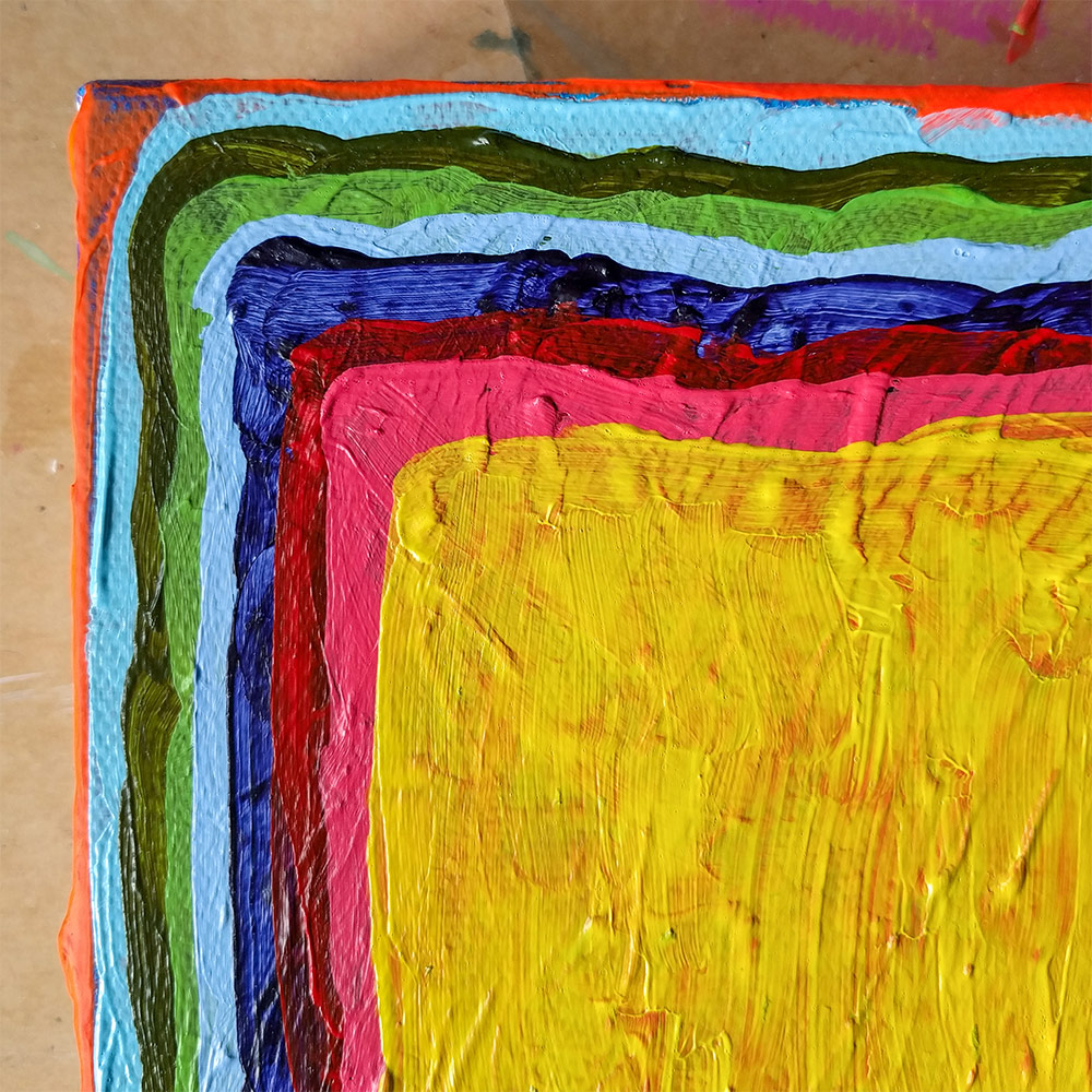
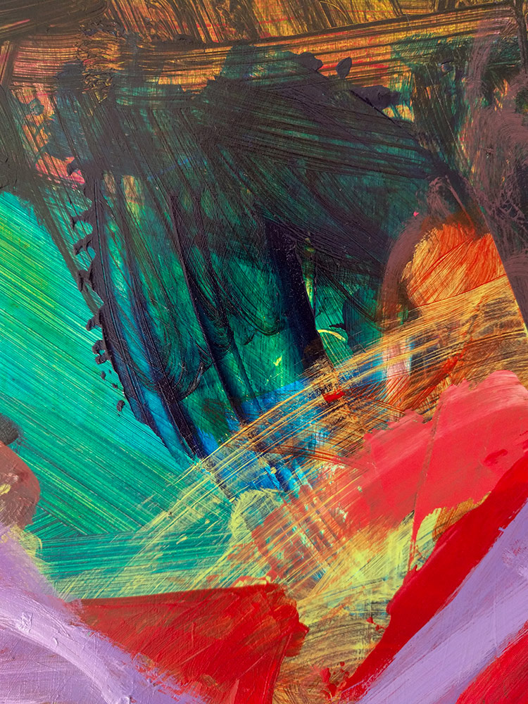
Detail – work in progress
acrylic on canvas
A couple of articles in the Guardian caught my eye this week:
-
‘It’s about solidarity’: the artists who hijacked the Turner prize speak out by Charlotte Higgins
They asked to be judged as a collective – so all four shortlisted artists won. They explain how our toxic political climate made them take a stand against individualism.
-
Put our colonial history on the curriculum – then we’ll understand who we really are by Maya Goodfellow
Britain’s past weighs on our present: learning about it would mean a better debate about race and migration.
-
Both articles feel very pertinent to me.
The four artists combining to make a strong symbolic statement in such a volatile political climate feels very much like the right thing to do. It’s inspiring to see artists coming together, being true to their values and taking a stand.
In the penultimate paragraph there’s talk of a shift, of “a mood of unpicking authority, of seeing through the accepted matrices of power and questioning them. It is possible that the world is moving beyond the monolithic, winner-takes-all prize – increasingly people are questioning the act that holds up one artist as the best.” I’m intrigued as to what this new world will look like and how it will operate.
I think the second article resonated with me as being from the UK and now living in Aotearoa New Zealand it’s impossible not to be aware of the various effects of colonialism and how it shapes this country. Acknowledging one’s own history, especially the bits we’d rather not look at, is essential for developing identity and understanding ourselves. I mean this both personally and as a nation, and yes, it’s a complicated, challenging, and difficult process, but one which is vital.
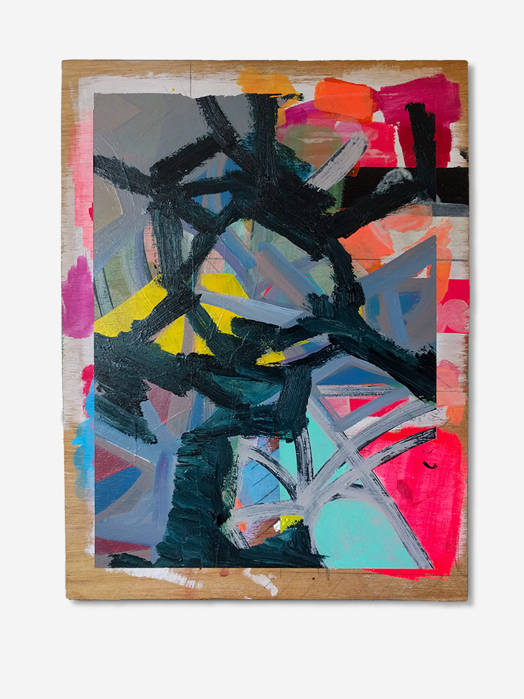
Untitled (My Little Beautiful)
acrylic on plywood
310 × 415mm
2019
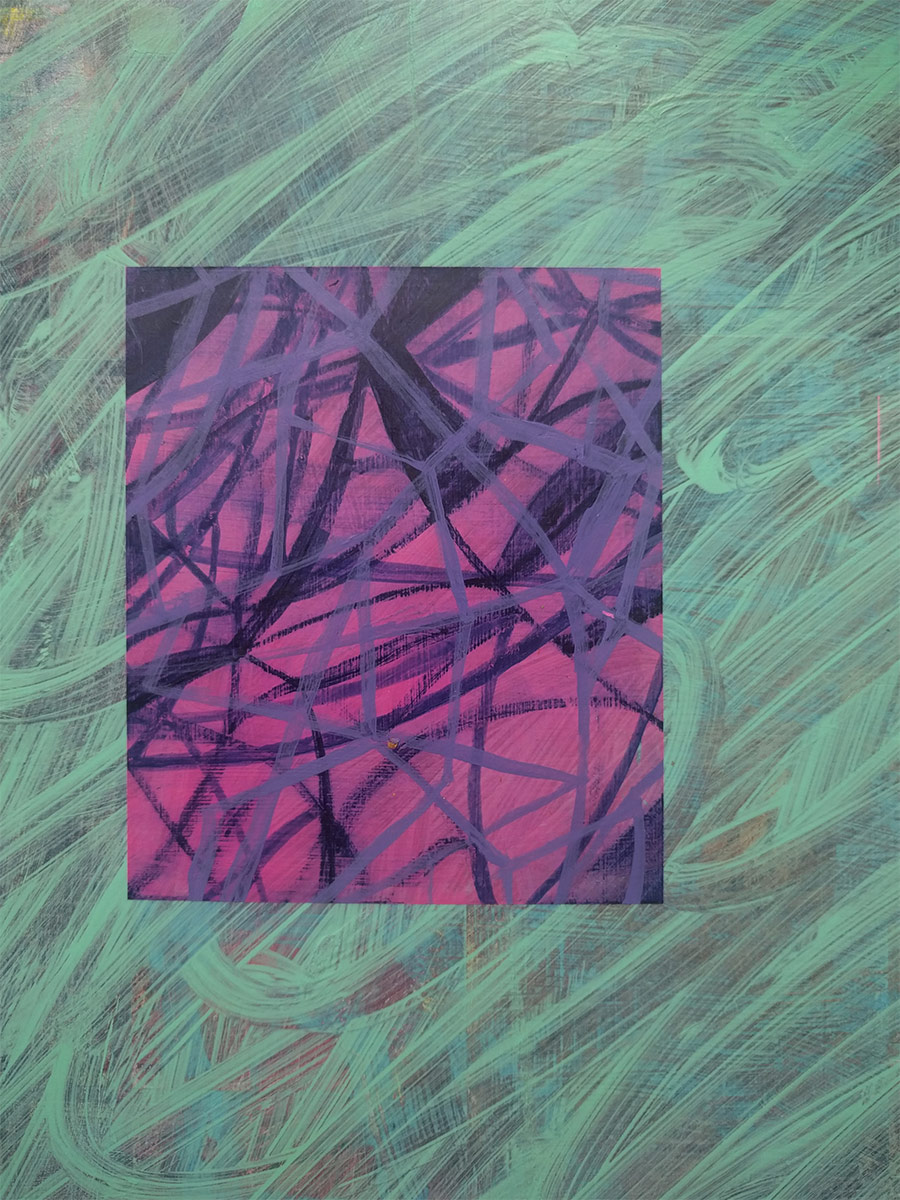
Detail – work in progress
Sometimes, just occasionally, I worry the details are more interesting than the whole work. But then perhaps there’s an opportunity for a whole new body of work…