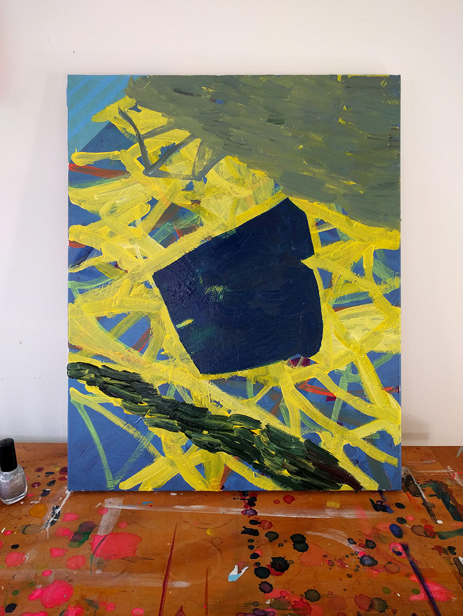
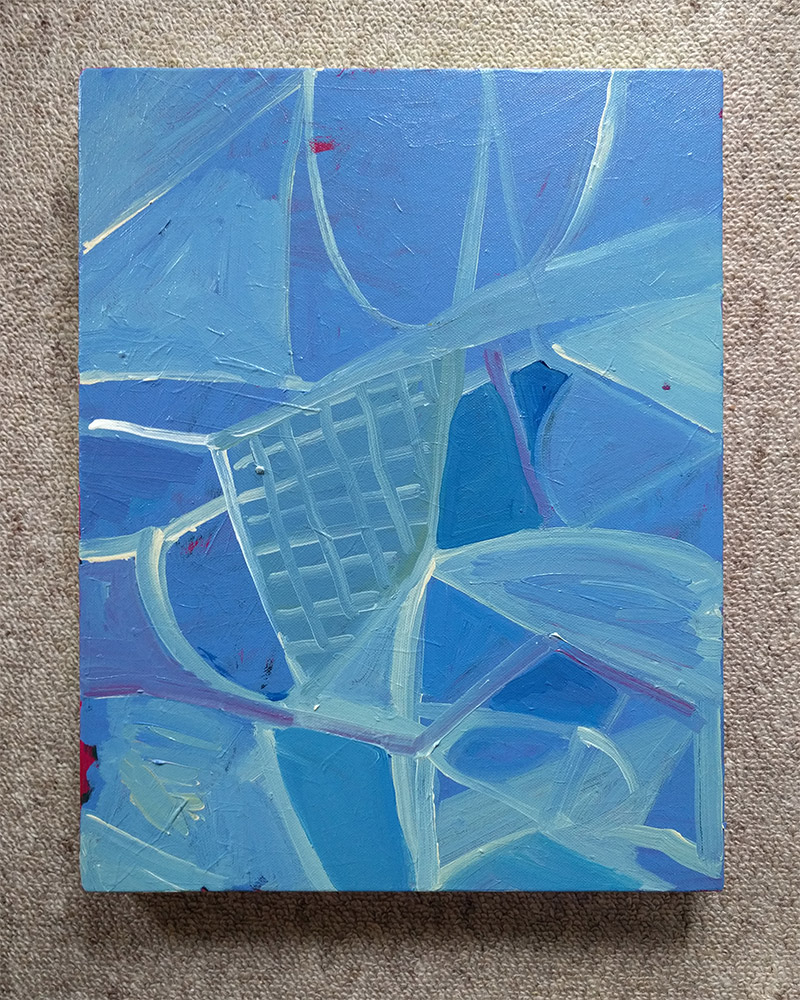
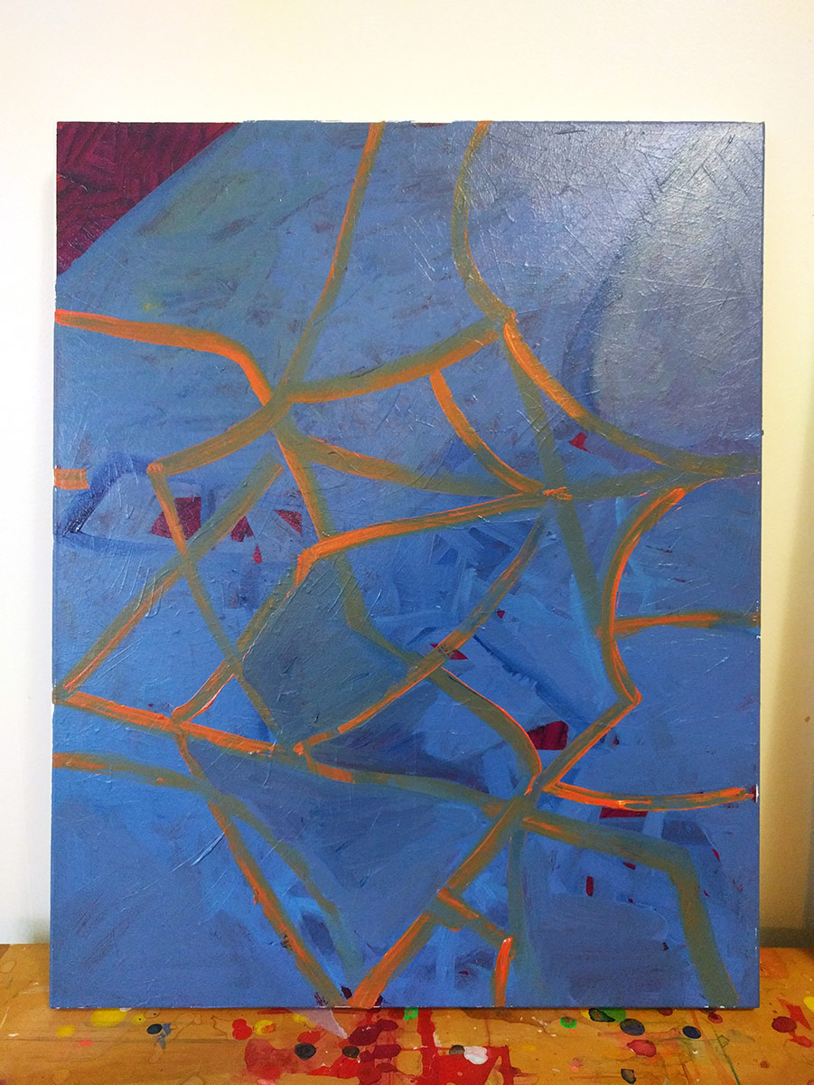
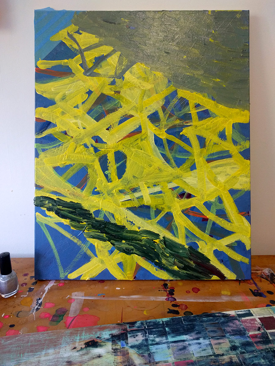
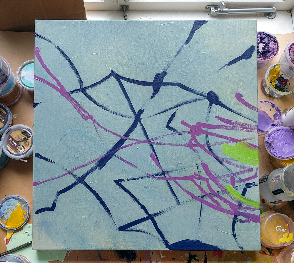
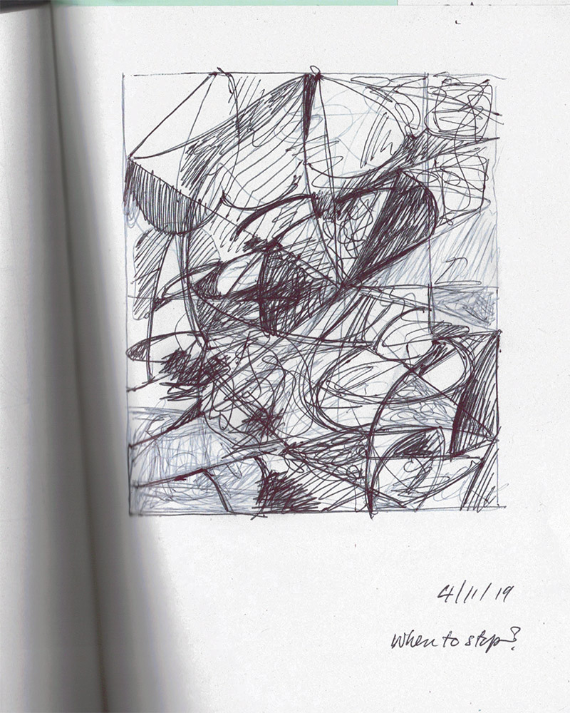
TV drawing

post.hero-title

Sketchbook scan
ink on recycled paper
98 × 116mm
2019

Made while half watching TV. Not that the TV was bad, more that sometimes I find it useful to be partially distracted when making this kind of drawing.

Wall work ideas in Photoshop

Blue wall work split across to walls - mock up Yellow wall work on floating screen - mock up Orange wall work on end wall - mock up

Wall work studies
Photoshop mock up
2019

Looking at the three works above I can’t help but think the practicalities to efficiently execute them.

The yellow one is the simplest, but the blue and orange pieces will require an awful lot of tape and masking. For both works it’s the long continuous outside edge which causes the biggest challenge.

In deciding which works to use (or not) I have to consider not only the practicalities of both the install and de-install times but also the way the different works relate to each other in the show and how everything works as a whole.

Swiss repeat

post.hero-title

Repeat pattern repeated
felt tip pen on paper
approx 840 × 840mm
2019

Something I made on the weekend at an enjoyable “Swiss Repeat” pattern workshop with Greta Menzies at Toi Pōneke.

Non-making

post.hero-title

Sketchbook scan


It’s raining outside – a perfect day to stay indoors, type and drink some more coffee. Meanwhile, this week has been one of those where I’ve spent most of my time doing non-making art related things.

This has included:

  • Going through my contact list and slowly cleaning it up.

  • Reviewing what I’ve written about my work over the last few months before I write some more words for my upcoming show New Old Forms.

  • Attending a talk at Enjoy around developing an emerging practice.

  • Going to the Greta Menzies opening at Toi Pōneke last night, where I really enjoyed some of the drawings.

  • Reviewing and processing some of the topics from conversations I had the previous week.

As someone who enjoys making things it’s easy to feel I’m letting my practice slip if I haven’t made anything during the week, yet I know a break can be (and often is) beneficial.

The reality is making is only part of a practice. It’s easy for me to overlook the drawing I have done this week. However small it may be it keeps moving the work and ideas along. And sometimes that’s enough.

Three things from the last two weeks

1. The paintings of Bernard Piffaretti

Painting by Bernard Piffarettie. Black lines on white ground.

Bernard Piffaretti
Untitled (2005)
acrylic on canvas
38 1/8 × 57 3/8 × 7/8 inches
© Bernard Piffaretti

I’ve been aware of Piffaretti’s work before now and reading this article brought them to my attention again. I can’t help but look and keep looking at his work – it’s a spot-the-difference game coupled with the how-did-he-make-it question. And then there’s the language of gesture, of impulse and expression being undermined by the careful but not a one hundred percent accurate repetition – you see drips and small differences. They’re clever paintings and leave me wanting to know more.

2. I’ve got the moves by Habibi

Record sleeve image.

YouTube

A great little song. And yes, I’m adding I’ve got the moves to my list of titles – just got to find the right work for it.

3. Gordon Walters at Te Papa

Gordon Walters, Untitled (X).

Untitled (X) 1989
Private collection, Auckland
Courtesy of the Gordon Walters Estate

Good to finally see some of Walters’ work in the flesh at Te Papa. It helped me put some of Simon Morris’ early work in context for me. I also felt very aware of my European heritage when looking at Walters’ work. My art history and exposure is, not surprisingly, different to my New Zealand peers – I’ve mentioned before how only after spending three months exploring the the landscape of the South Island did the work of Colin McCahon begin to make sense to me.

In this instance, while Walters is perhaps best known for his koru works, it was the works talking to European and American minimalism and abstraction which resonated with me.

A stocky, blocked black, white, and grey work of considered and subtle proportions reminded me of Sean Scully’s work. It had a real nice weight and presence to it.

A quiet, pale lilac / grey and white work of horizontal stripes with, I think, four asymmetrical interventions was gorgeous. I’m sorry I can’t find an image of it.

And a smaller canvas, pictured above, from the Transparencies works caught my too. Those colours, that blue for the overlap, are perfect.