Work in progress
I’ve been listening to Autechre over the last few days. Sitting at the experimental / “intelligent techno” end of the music spectrum it’s not always easy listening. While doing so I came across the following in Gregory Heaney’s review of EPs 1991–2002,
“What really ties the set together, however, is the packaging. Stark, minimal, and austere, the collection has a physical presence that seems to embody the spirit of the band, offering no explanations or assistance in the way of liner notes or even a detailed track list that points out what songs come from which albums. Instead, like Autechre themselves, EPs 1991–2002 simply presents the listener with the music the band has made and lets them come to grips with it on their own terms, allowing them to draw their own conclusions about what they’re hearing without any unnecessary assistance from its creators.”
Such reduced presentation has strong parallels with much contemporary art, with work often presented as is, with little if any explanation. Titles, medium, date listed on a room sheet and that’s your lot.
This got me thinking: how does this approach sit next to being open and transparent about my practice? How open do I want to be? How much do I want to share, how much do I want to hold back? How much is it necessary to hold back?
I realise it’s not necessarily an either/or situation, but is worth some thought.
Image via Creative Review
No five things this week, instead a catch up on what’s been happening in the studio this week – I’ve been working on a couple of small blue monochromes and also taking steps towards creating a larger monochrome work.
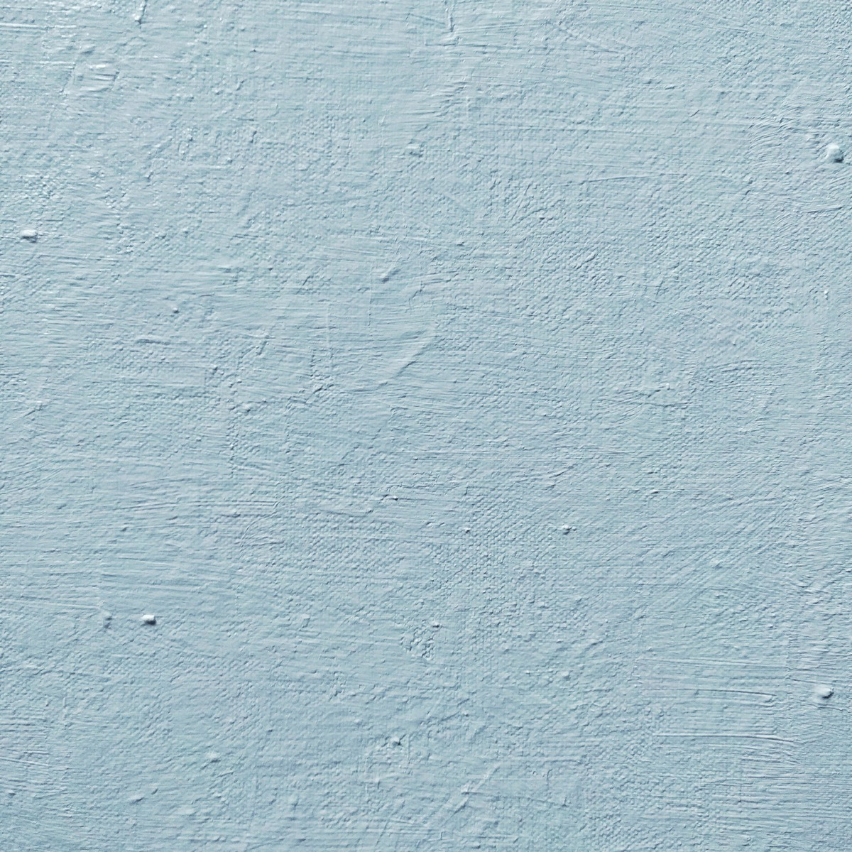
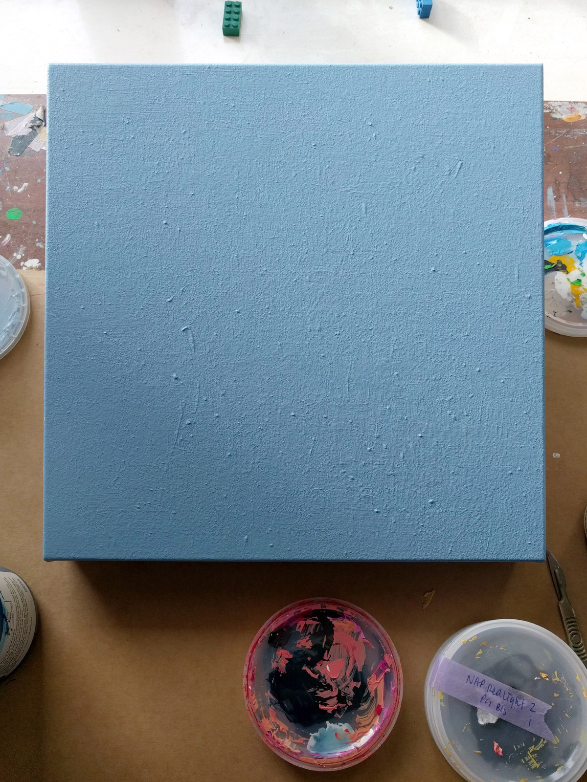
Of the pale blue monochromes, I’ve a couple on the go. One sits on the wall as I decide how to deal with the edges of the work, the other on my desk waiting for another layer of paint. Both use older paintings as a starting point.
In going over old works, the quality of the painting surface is quite different from working on a pristine surface. It’s less absorbent for starters. Also, the textures of the previous work are still apparent at certain angles under a couple of layers of paint. With more layers they’ll become hidden.
In making monochromes this way I can either accept and absorb the history of the previous works or paint everything a flat grey, which makes for quite horrible surface to work on. So I’m going for the former option.
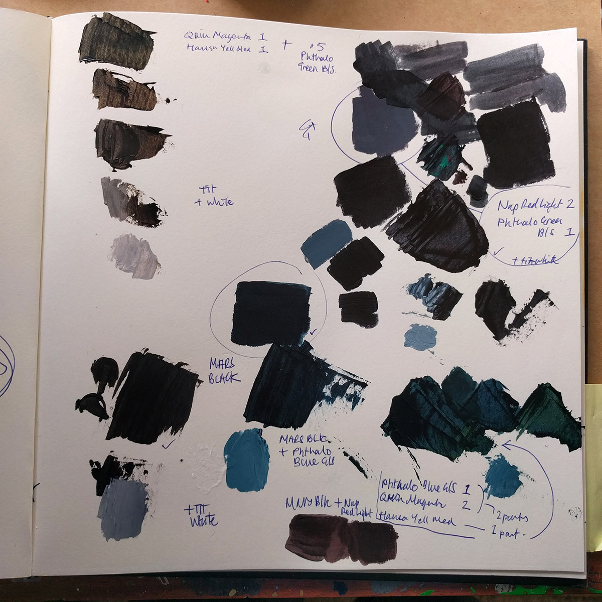
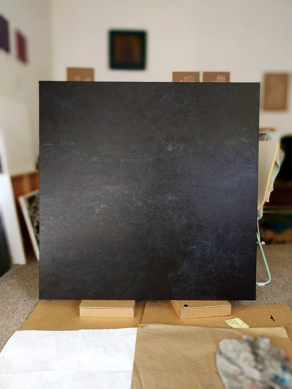
Away from the blue works I’ve been mixing different blacks for a larger monochrome work I’m considering. I could use a black straight from the tube but in mixing my own there’s the opportunity to create something richer and more alive. This larger work will again involve going over an older unresolved work dug out from storage. It has areas that are quite different tonally and I’m interested to see how this contrast comes through once I start to build up the new layers of paint. But first, I need to choose which black to use.
From the National Gallery, London
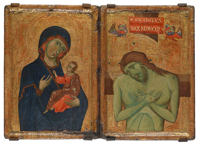
Umbrian Diptych Master of the Borgo Crucifix (Master of the Franciscan Crucifixes) about 1255–60
The Virgin and Child Egg tempera on poplar 32.2 × 22.9 cm
The Man of Sorrows Egg tempera on poplar 32.3 × 23 cm
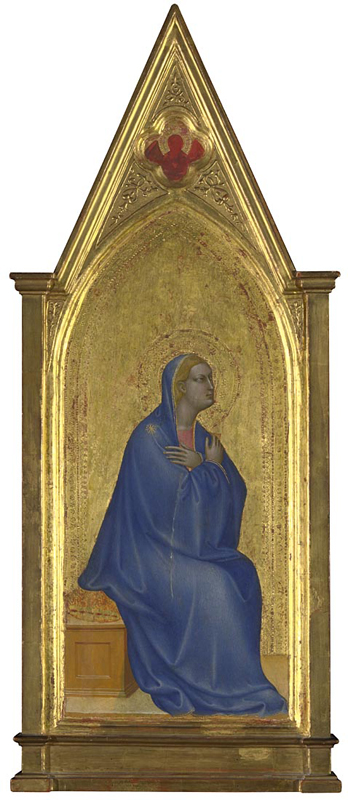
Giovanni da Milano The Virgin: Left Pinnacle Panel Pinnacle Panels about 1365 Egg tempera on wood 89.3 × 37.2 cm
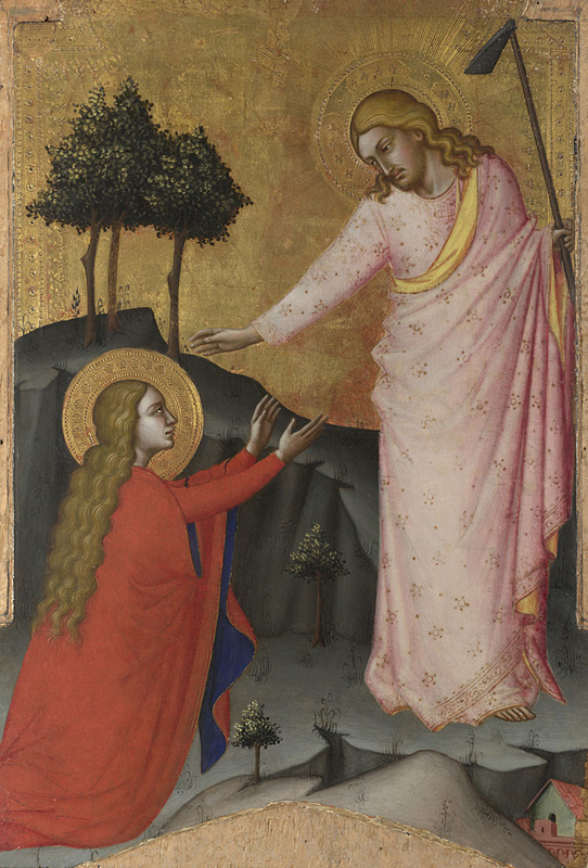
Probably by Jacopo di Cione Noli me tangere about 1368–70 Egg tempera on wood 56 × 38.2 cm
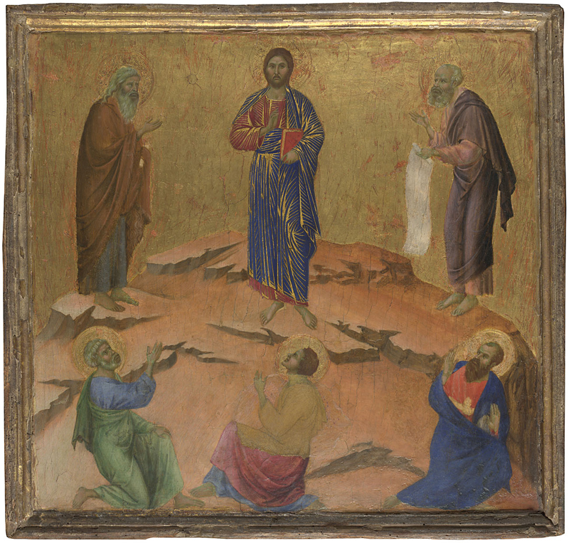
Duccio The Transfiguration Group Maestà Predella Panels 1307/8–11 Egg tempera on wood 48.5 × 51.4 cm
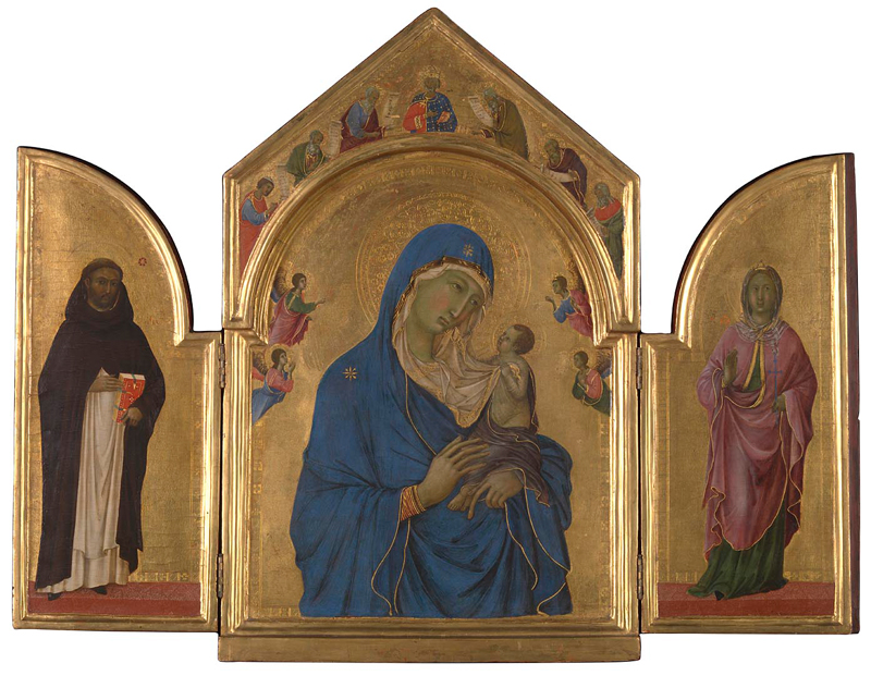
Duccio The Virgin and Child with Saint Dominic and Saint Aurea, and Patriarchs and Prophets about 1312–15 (?) Egg tempera on wood 61.4 × 39.3 cm
While I’m far from religious, whenever I’m in London I try and get to the Sainsbury Wing of the National Gallery to look at the Icons and altar pieces. My foundation tutor was really keen on them and I’m sure his enthusiasm was an influence. I particularly appreciate the “objectness” of them, which these images don’t fully carry. Like most painting, it’s best seen in the flesh. And ideally more than once. Different days, different times, under different circumstances and if you’re lucky, different light. What resonates one day may not the next. It’s these revelations and small observations that are part of the pleasure of looking at and living with art.
And talking of moving at a different pace, if you’re following it today, enjoy the cricket and have a great Easter break.
Five doodles
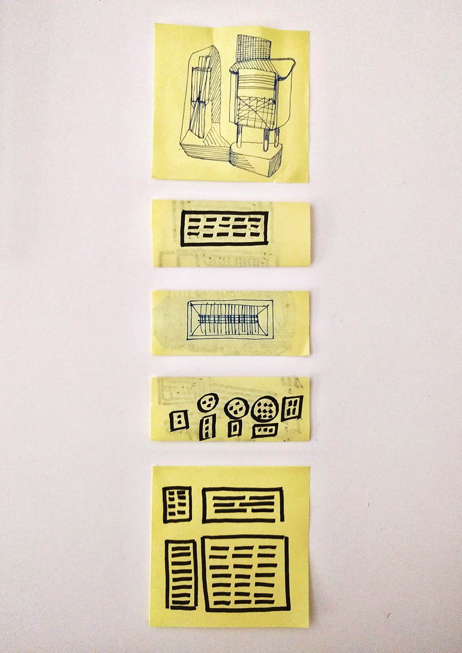
I’ve pretty much always doodled. I can remember at the age of 16 being told off in my Maths class for doodling in pencil on the table (it could easily be wiped clean). Now at meetings if I’ve a pen and notebook in my hand, I’ll not only take notes but I’ll end up doodling too, sometimes quite prodigiously.
I’ve tried to enlarge my doodles before now, to turn them into paintings, but it’s never really worked. I’ve learnt they’re a thing in and of themselves. They don’t need to be anything else. If I do start thinking they’re going to become paintings or something else I become self-conscious of my actions. The doodles suffer, they feel forced – their strength lies in the their semi-conscious, automatic making.
These five were made over the last week or so. Sitting at my table, half watching something on my laptop or while taking a break between one thing and the next. The top one with the forms standing in space is kind of typical. I’ll often draw object type forms. The black ones, made using a lettering pen, are more unusual while for the middle one I may well have been thinking of a light fitting or working out how to construct a painting.