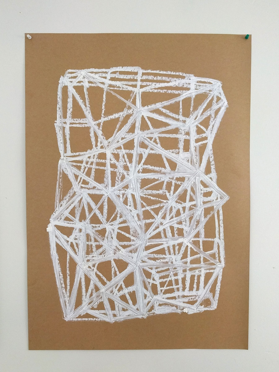
Two drawings I made when I should have been doing something else
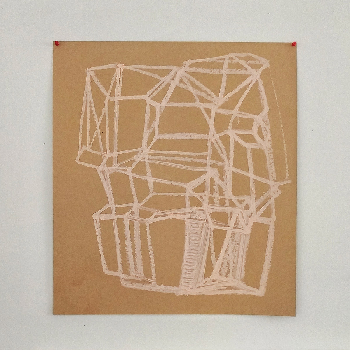
oil stick on kraftcard 540 × 600mm and 600 × 840mm
oil stick on kraftcard 540 × 600mm and 600 × 840mm
Blasts from the past – five works, one every five years starting from my foundation course in 1989/90 up to 2010.
1 1989/90
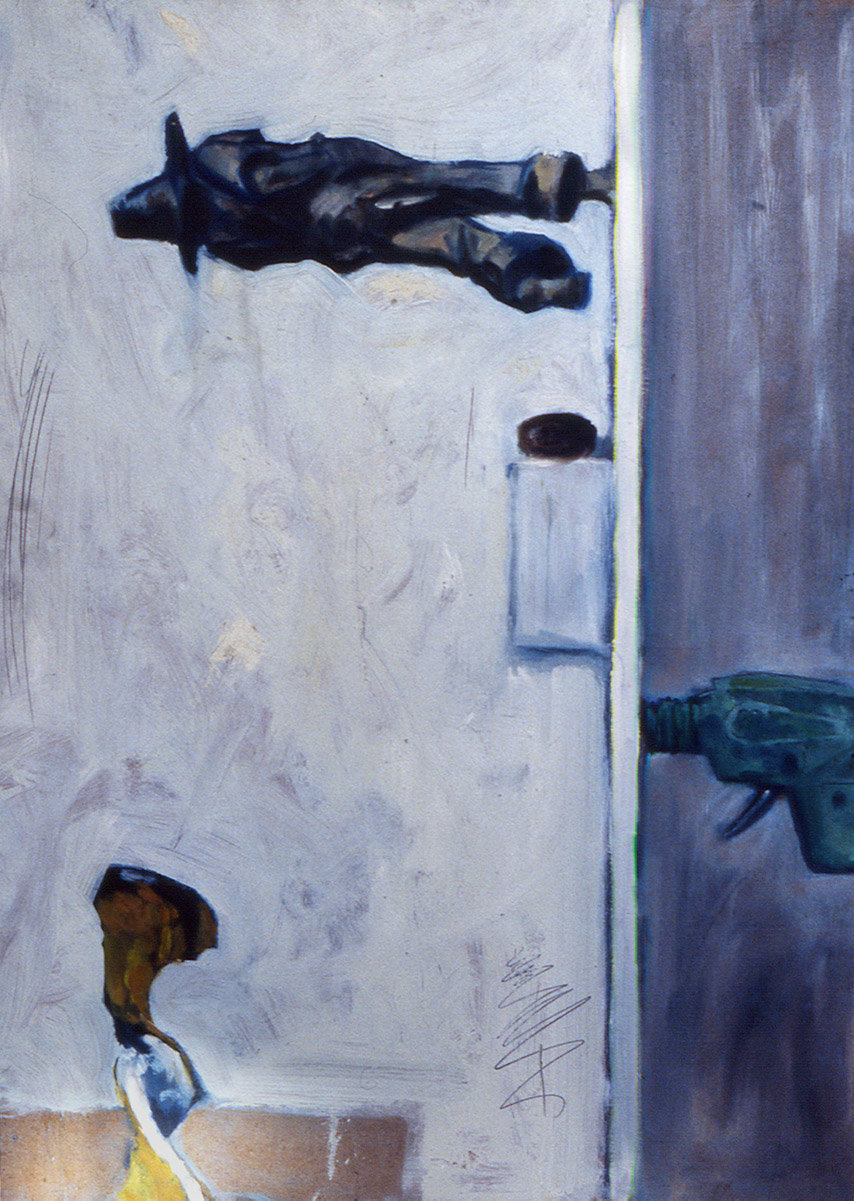
A still life painting exercise from my Foundation course. Oil on hardboard. The carved figure is one my Dad made.The other objects are some sort of nut, a plastic toy space gun and piece of grapefruit peel.
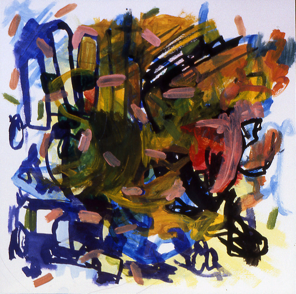
2 1994/95
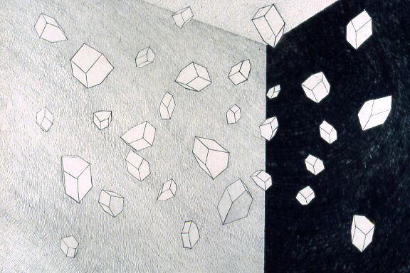
A drawing made a year or two after my finishing my Honours Degree. I was making small plaster objects of geometric house like forms. I used cardboard to make the initial mould and then latex to make a reusable one.
3 1999/2000
acrylic ink and paint on paper
Not too sure when this was made but it’s around this time. I was a living in Devon and working from home. A drawing of sorts. I think it was a one of those pieces of paper where I was cleaning my brush or using up excess paint, a by-product of sorts, but I like it.
4 2004/05
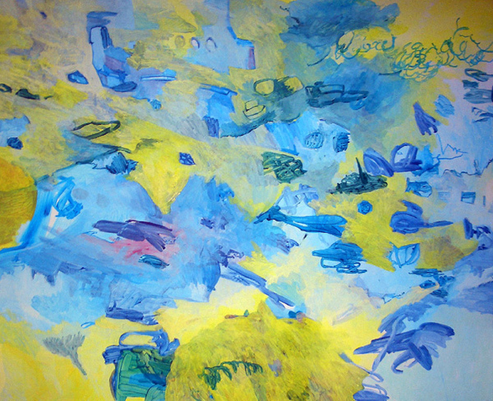
Electric sugar acrylic on mdf approx 1200 × 900mm
Made while house-sitting for friends in London. Fortunately for me, one of the bedrooms was in the process of being decorated so I had a free studio for a month. It’s a decent size woek, and I was still very much into gestural mark making. The title comes from a Tom Waits lyric, “…and over in The burnt yellow tent By the frozen tractor, the Music was like electric sugar”.
5 2009/10
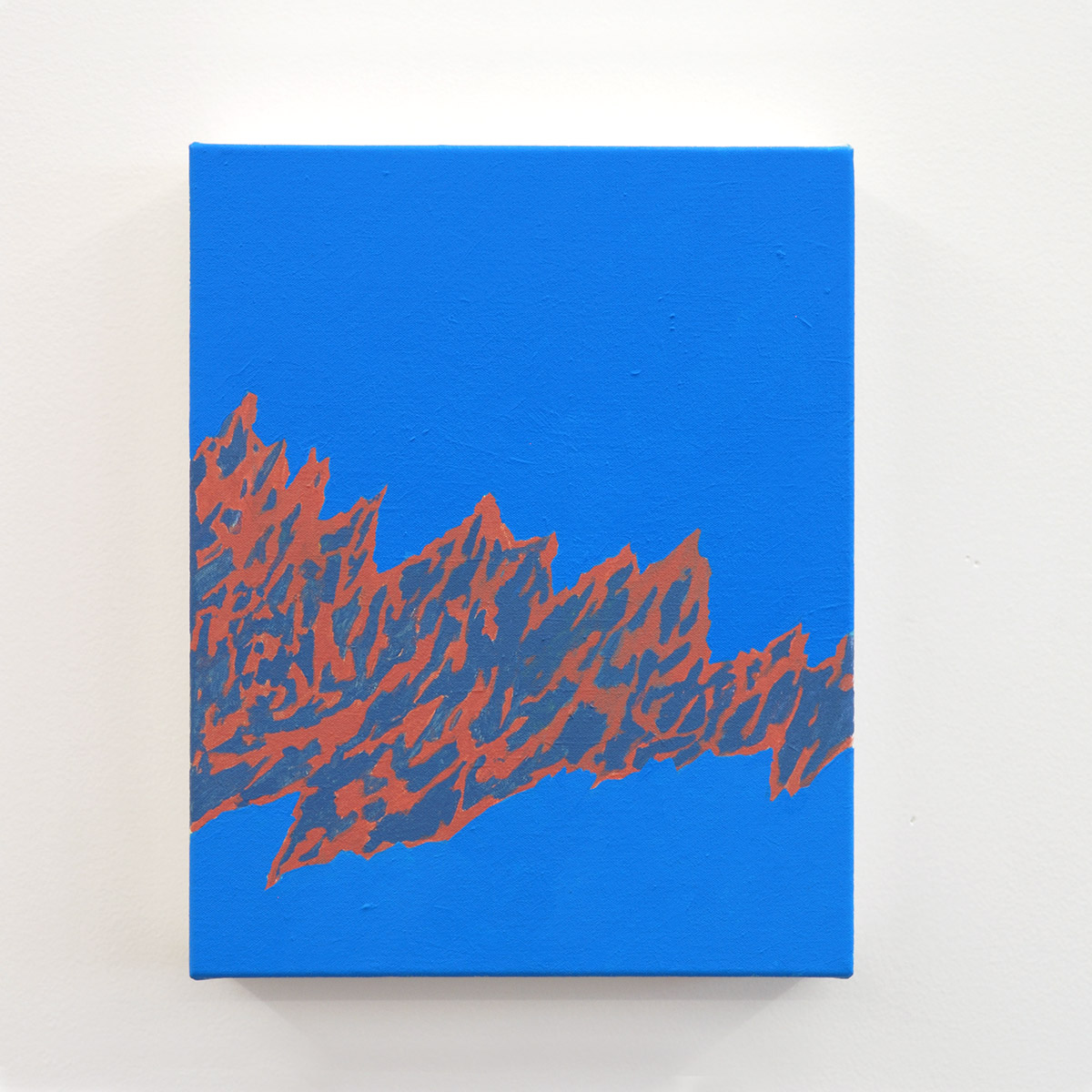
Fissure acrylic on canvas 200 × 250mm
A work from my “One for you, one for me” project, where I asked people on my mailing list to cover my costs to make two works. In return they’d get one of the works and I’d keep the other. I exhibited all the paintings in my studio at Toi Pōneke and randomly selected the works for the supporters of the project.
In looking at these images I’m struck by how different a story would be told if I had chosen five different images. Quite how representative they are of my practice as a whole is really up for question. In fact it’s safe to say they offer momentary snapshots and these are the ones that caught my eye today. Another day and it could be five different images and a totally new story.
And on a different note, it’s quite something to realise I’ve been making art for almost thirty years…
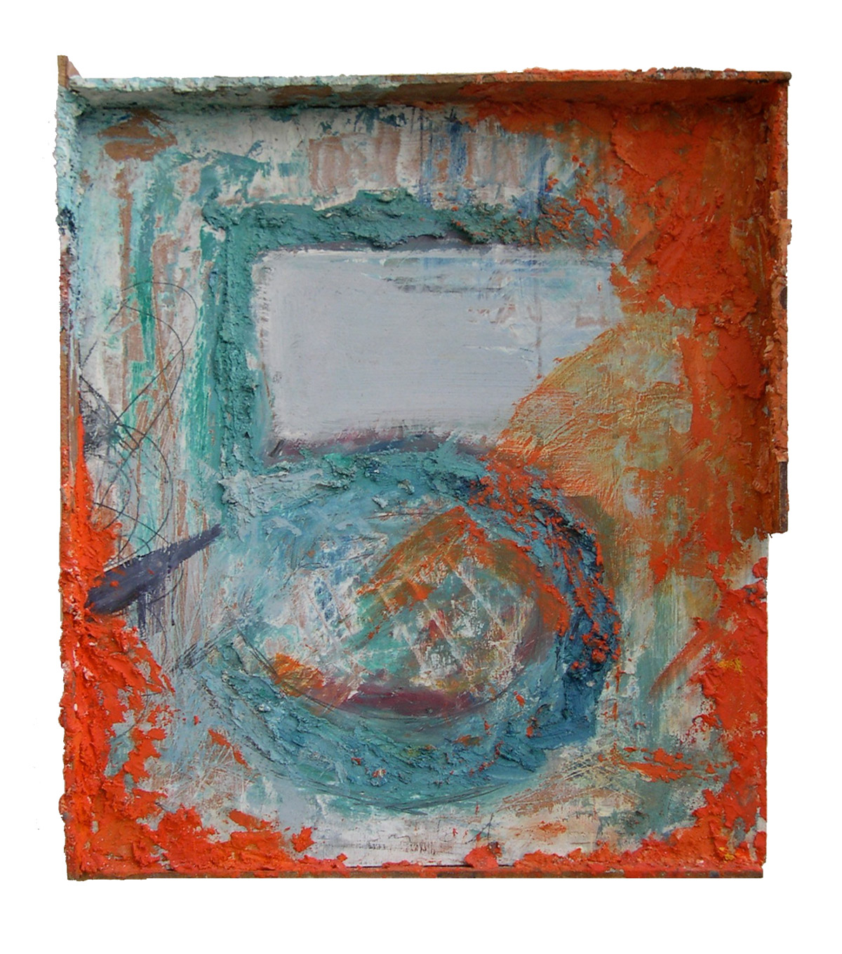
The test piece from the other week. I’m living with the work for now – seeing it at different times of the day, in different states of mind. I’m really liking some of the textures, however the balance of the tones isn’t working for me, but that’s ok. The illusionistic three dimensional nature of the work is something for me to contend with too. How much do I want to manipulate this, or not? For now what’s needed is time, looking and pondering.
I rather liked this short blog post by Austin Kleon - The way we talk about influence is backwards.
Rather than Van Gogh influencing Basquiat (which is kind of impossible if you think about it, and implies passivity on the part of Basquiat), try instead thinking of Baquiat working on Van Gogh…
I particularly like how, in the quoted Michael Baxandall text, this new arrangement opens up the language we use.
As an experiment, I’ve started the year trying to work in eight week blocks. I got the idea from a couple of different places. Now half way through my first block and I’m thinking of changing tack. I expect I’ll write more on this at a later date.
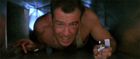
Image from Die Hard
Die Hard meets the essay Lethal Theory, “walking through walls” and “what it means to bend space to your own particular navigational needs”.
Read (approx 10 mins) or listen (approx 14 mins) to this text by Geoff Manaugh.
A couple of conversations about personas (for artists) got me thinking about the Tom Peters book The Brand You 50. (He’s no relation, or at least not that I know of!) I’ve got the book tucked away somewhere along with his book Re-imagine. Both are full of provocative nuggets. It could be time to dig them out for a browse.
1
There’s a review of A Slow Take over at Eye Contact site. It’s written by John Hurrell. I was introduced to John at the opening (thanks Maggie!) and noticed later in the evening he was having a close look at my work, which was great to see. And I find it’s interesting he mentions Billy Apple as I was thinking of one of his works just the other week.
2
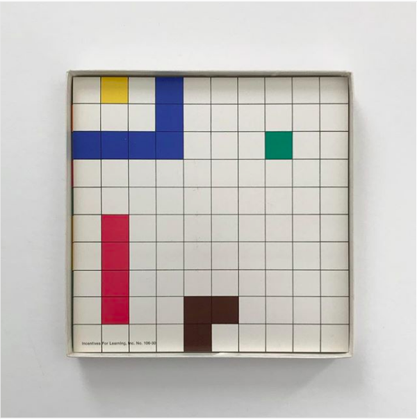
Two images I liked on instagram this week. Click through to go to the original post.
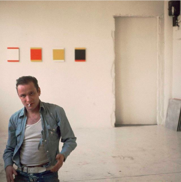
Yup, that’s Blinky Palermo.
3
Choir! Choir! Choir! + David Byrne singing David Bowie’s Heroes. Discovered one morning this week – a slow start and then… well, what a way to start my day.
4
A short article looking at the Japanese perspective of space. The author looks at four types of space:
“Instead of being about the built environment, the Japanese words for space center on the interactions and relationships among people.”
”In Japan, a building can’t be in Tokyo without Tokyo being in the building.”
5
One of mine from 1989-90. Oil paint with Polyfilla on board